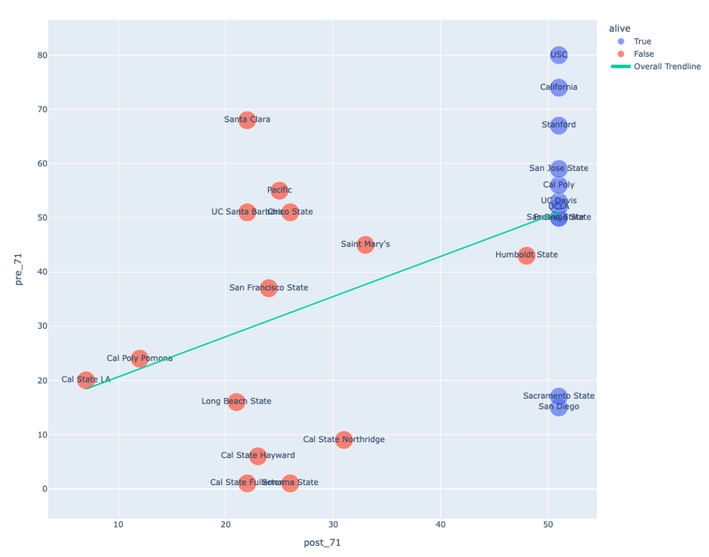
The Lindy Effect says age predicts longevity so let’s try to make a graph that can test that. Plotly makes it pretty easy to scratch the itch and get the graph you think you want. Here’s my attempt at a scatter plot showing relationship of pre-1971 years to post-1971 years for programs both alive and dead. The line is a regression trendline created by the API. R2=.225
(Link to download here.) I got there with a little basic code to split the spans based on 1971 as our pivot year and then sum up the years on either side of the divide and whether the programs were still alive.
When you see it arrayed this way it becomes pretty clear that there was a mid-90s “extinction event” that affected programs up and down the age spectrum. 1991 is 20 on the x axis. Within 8 years, 9 programs are dead. Santa Clara had almost 90 years of football. The wikipedia article states: “At the conclusion of the 1992 season, the Santa Clara football program was discontinued due to new NCAA regulations which mandated all sports be played at the same level at each university.” I wonder if the NCAA would have this kind of clout today. Considering its legal losses in the face of NIL and the rising strength of the conferences as individual entities I doubt it. Why force Santa Clara to field D1 football if they have D1 track? Who cares?
In 1971 all the y-axis values were fixed, and we can see the passage of time since then along the x-axis. At time zero everyone was blue, and as time spooled out left to right some of the dots turned red and remained in place where they died. On the far right all those blue dots are still going concerns. The programs who started at 50+ y-value suffered some losses, but that blue cluster in the top right shows how many remained. Those below the 30-line on the y-axis were crushed, but not completely.
In other words there is a “Lindy Line” somewhere around y=50. The “old” outliers who died are Santa Clara, Pacific, UCSB and Chico. “Young” surviving outliers are Sacramento State and USD. (Without those six the R2 value is a much more robust .652.) I don’t have a theory that neatly accounts for those.
A naive approach to stats (my approach) is to say that R2 tells us that a program’s pre-1971 span is 23% of the explanation for their post-1971 span. This seems about right. Clearly the 90s reaping is a huge factor and there are a few other things going on. All in all it looks like Lindy Effect mattered but isn’t some absolute source of truth.
In the code I also tried to enumerate all the team v. team dyads and test how a Lindy Effect-driven prediction of their longevity compares to reality, and whether Lindy is above random. Of 300 dyads there are 166 correct predictions, (55%) but 59 of these dyads are “ties” where each survive. If you throw those out the success rate goes up to 69%. It’s not clear to me if this is more illuminating than the scatter plot since it basically uses the same pre/post spans in a slightly different fashion.
Was pulling in the plotly libraries a good idea or should I have used r or done some excel magic? I can honestly say two thumbs up for plotly. Writing the actual python code and getting the graphs to pop up was fun and only a fraction of the time spent on this. The hard part was trying to refine what I actually was asking, describe the problem, debug my dataset and write it up. I’m still not totally confident in the robustness of my stats approach but at least I went a little deeper than just “that looks like something.”
Lindy Effect in California College Football: real, but not omnipotent.