The mid-century expansion (and subsequent contraction) in Cal State football programs is a fascinating little story I want to dig into more. From the vantage point of 2022 it’s hard to believe that schools like UCSB, Cal State LA, Cal State Hayward and Sonoma State were all playing major college football in the modern era.
The peak is around 1971 which fits our Vietnam/Baby Boom hypothesis: there were more college kids than ever and they wanted football teams. California itself was still running fairly “cheap” before Cost Disease and accrued pension obligations dragged it down. When all those costs started to snowball by the lates 70s football programs began to fall to “budget cuts.” (I put “budget cuts” in quotes since it is used so much in documenting these things. Obviously budget money is fungible and there’s no particular resason for a college to have or not have a college football program. So the phrase “budget cuts” is just a convenient catch-all tautology.) Since 1971 is now fifty years ago it let’s take a look at some very basic “do they play football?” data in the context of the Lindy Effect.
The Lindy Effect roughly states that we can predict how long something will last by how long it has already lasted. It was made popular in a book by Nassim Nicholas Taleb, so it’s got kind of a bro-science taint. But it does represent an interesting way of looking at things. So does it hold true for this? We have 50 years of data on either side of 1971 with programs beginning at different times. If the Lindy Effect holds we should expect the programs that lasted the longest to be the ones that started the earliest.
I collected some data using wikipedia’s histories of the programs. These entries are roughly all the programs playing D1, D1-AA and D2 college football in 1971:
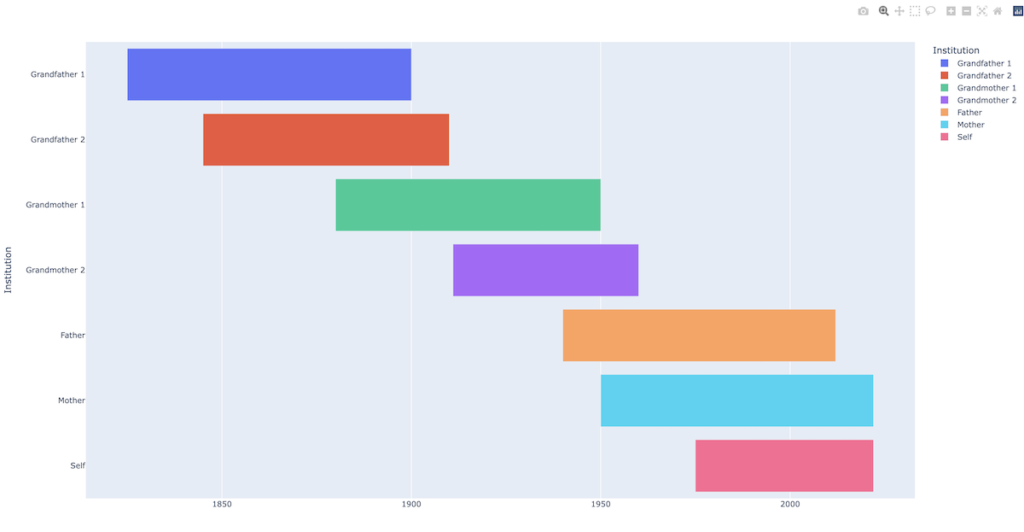
This isn’t very helpful. It certainly seems like being an “old program” has some predictive power but it would be nice to see a graph and write a little code to get some actual numbers out. Those charts that show different parallel timespans in horizontal lines are called Gantt Charts. We can imagine two idealized different versions. One, let’s call “lifespans,” where the spans are all about the same length and they cascade through start and end time like human lives:
Another, where the spans are purely Lindy Effect driven around a focal year, and each span is less than the one older than it. Let’s call this the “layer cake”:
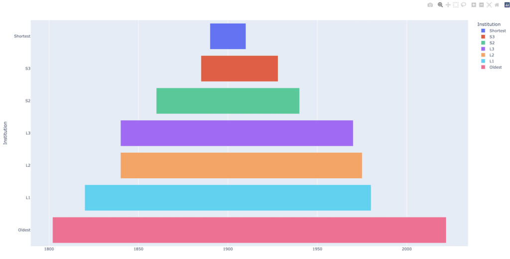
What great graphs, right? As a decided non-expert in graph-making I went looking for an easy way since google sheets doesn’t do Gantt Charts. We could use r but since we’re doing this in python so far let’s try plotly. So far it’s been very impressive. Here’s the extent of the code to create the above lifespans chart:
##
# February 8, 2022
#
# simple made up gantt chart showing lifespans
#
import plotly.express as px
import pandas as pd

df = pd.DataFrame([

    dict(Task="GF1", Start='1825-01-01', Finish='1900-01-01', Institution="Grandfather 1"),
    dict(Task="GF2", Start='1845-01-01', Finish='1910-01-01', Institution="Grandfather 2"),
    dict(Task="GM1", Start='1880-01-01', Finish='1950-01-01', Institution="Grandmother 1"),
    dict(Task="GM2", Start='1911-01-01', Finish='1960-01-01', Institution="Grandmother 2"),
    dict(Task="F", Start='1940-01-01', Finish='2012-01-01', Institution="Father"),
    dict(Task="M", Start='1950-01-01', Finish='2022-01-01', Institution="Mother"),
    dict(Task="S", Start='1975-01-01', Finish='2022-01-01', Institution="Self"),
])

fig = px.timeline(df, x_start="Start", x_end="Finish", y="Institution", color="Institution")
fig.show()
The fig.show call by default launches a short-lived local webserver to render the graph in javascript. That’s a pretty impressive out-of-the-box experience. There’s also a layer you can add to export directly to image files but the launch-to-browser is great for iterating. This clearly violates our informal rule on keeping third party libraries to a minimum so it’s a good time to get acquainted with python3’s virtual environment system. We made a separate directory called datasets to do this work. Here’s the raw dump of commands:
python3 -m venv env
source env/bin/activate
pip3 install plotly==5.5.0
pip3 install --upgrade pip
pip3 install -U kaleido
pip3 install pandas
The venv command creates an env subdir which is sort of like a lightweight container. Once you activate with that particular env you enter a shell that has access to installed libs that are unique to this env. Plotly, kaleido and pandas are all “there” for that env only but we haven’t polluted the whole system with super-user pip3 installs. The command deactivate jumps out of the mini-shell.
How can we get our football data into this? I put together a fairly laborious proof of concept by hand-importing some of the data in this fashion:
dict(Task="Cal 1", Start='1886-01-01', Finish='1889-01-01', Program="California"),
dict(Task="Cal 2", Start='1890-01-01', Finish='1906-01-01', Program="California"),
dict(Task="Cal 3", Start='1916-01-01', Finish='2021-01-01', Program="California"),
dict(Task="Cal State LA", Start='1951-01-01', Finish='1978-01-01', Program="Cal State LA"),
What’s extra nice about plotly’s Gantt is that it can handle broken ranges that need to appear on the same timeline, so programs that have stopped and started football can be visualized accurately.
So that works. But obviously hand-copying data into a struct format is not a great practice for anything with more than a few entries. We’re back where we were building the test scenarios: how do we serialize our data for clean and easy use. In that case we were building ad-hoc cases that had to map directly into the structure we use in the rest of the code so we opted to build the structs in code. Here, we actually care about the data, it’s based on actual observances from the world and we want to visualize and then do whatever math later on. It seem like we should store it in the cleanest possible database possible, like a csv, and then invest the time to write some retrieve-and-parse code. Since the number of distinct time ranges varies from program to program we have a classic problem of how to normalize the dataset while staying “simple.”
I wanted to type up some progress before I forget what I did. In eyeballing the data for a while I think the Lindy Effect is interesting but it underestimates the fact that everything does, indeed, die. Even institutions not subject to biological mortality will eventually be gone. Pacific football reached back to the 19th century and it is gone. “This, too, shall pass” is the shadow motto for everything. Since the time Taleb published his book, Lindy’s closed for good.