I got the graph I wanted (link to download):
How did I get it? As we discussed before, it seems like investing in a separate csv for the dataset rather than baking it directly into code is a nice minimum of effort here. The google sheet is a decent front end data entry tool and then we can create and maintain a csv from there. Since each program can have multiple ranges when football started and stopped, a truly normalized dataset would split out ranges into a separate table and then key them to program by some unique ID. That’s overkill. Denormalize everything. The csv lines look like this:
Stanford,1891-1905; 1919-present,TRUE,TRUE,TRUE,FBS
California,1886-1888; 1890-1905; 1916-present,TRUE,TRUE,TRUE,FBS
San Jose State,1892-1900; 1921-present,TRUE,TRUE,TRUE,FBS
That means we have two parsing problems: the csv as a whole and the year ranges in the spans field. I am willing to take that on rather than doing something insane like trying to join two csvs on an arbitrary ID or go through the extra overhead and storage opacity of making this into a “real” db table. (Consider the maintenance problems of even a sqlite table. Being able to tweak a few values and check it back into git is very useful.)
Fortunately the python3 csv library does most of the hard work for us and we have two glorified calls to split() to do the rest. Then we build out the plotly data dictionary from the structures. Here’s the checked in code. The word “present” is our magic word to indicate a lifespan that’s still ticking.
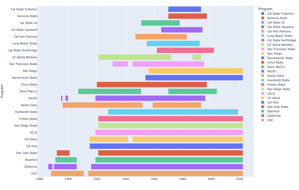
I added a sort by total duration so we can visually get a sense of whether the chart looks like lifespans or layer cake. Answer: pretty cakey!
The top seven layers on the cake are Cal State programs founded in the post-war era and now all defunct. The bottom nine layers are all currently operating. One clear visual outlier to the “cake” model is Santa Clara, which had a very old program that ended in 1993. On the right side we see San Diego and Sacramento State as postwar programs that still continue into the present.
Some caveats to this dataset: We only include programs that were in operation in 1971. The reason for that is to have as much future time as possible to judge Lindy Effect(s). We also have only included schools that played in Divisions I and 2. Because schools have popped up and down over time it doesn’t make sense to restrict to FCS or FBS. For these reasons this chart is not an accurate representation of the California College Football ecosystem over the years in question. If a program was started in the 80s and still going strong it would not appear. (Spoiler : there are none.) Similarly we don’t see our old friend University of San Francisco on here, because they had already folded by 1952.
A more complete graph would allow us to make more generalizations about program lifespans. A chart that included D3 would include programs like Occidental (100 year history ended just before the pandemic) or Menlo College (started in the 80s, ended 2015.) For now I don’t have confidence I can research all of D3 easily. Safe to say, however, that there is no current major boom in starting College Football programs in California.
For now the next step is a sweep through this dataset to answer the question we originally asked: Can we make sound predictions about the future prospects of an institution from its longevity at the time?